.jpg?width=300&name=Dairy%20Plant%20with%20Milk%20Hauling%20Truck%20(1).jpg)
Connecting the
dairy supply chain
MADCAP securely automates and manages every aspect of your raw milk procurement - ensuring you stay one step ahead.

Streamline business-critical processes with automation for efficiency, accuracy and visibility across your entire operation.
Learn more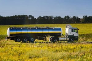
Move milk efficiently, optimize fleet resources and obtain full traceability and efficiency in your operations.
Learn more
Collect accurate data, improve management of quality testing and securely share data and reporting with stakeholders.
Learn more

.png?width=300&name=Yili%20Logo%20(2).png)
MADCAP digitizes dairy operations around the world
Driving efficiency and sustainability for a more productive and profitable industry- Transport
- Collection
- Quality
- Payments & Billing
- Communications & Collaboration
- Data & Analytics
Transport
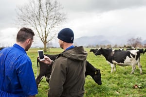
Collect milk efficiently, with clear visibility of runs and loads across all your trucks and logistical operation. Accurate, real-time monitoring of raw milk load temperatures, volumes and location enables more informed decisions around scheduling, route optimization and delivery, giving you greater control over milk quality.
Collection
Obtain full traceability and efficiency in your procurement operations, from farm to factory. Real-time data capture gives you visibility over collected volumes of each milk load, enabling more efficient reporting and the ability to respond to any issues that arise quickly.
Quality
Achieve confidence in compliance and product standards. Access to critical, real-time data allows for timely identification and remediation of irregularities, reducing the risk of further issues throughout the production process.
Payments & Billing
Get complete transparency across contracts and payments with greater accuracy and visibility of all payment data. Automate transactions, forecast payments, connect customer and supplier data, pay haulers and producers, and manage complex transaction formulas from a single platform.
Communications & Collaboration
Stay up to date with farm information, wherever you need to work. Access to more timely pickup, quality and component information in a centralized reporting and communication platform enables better, more streamlined decision-making, with greater transparency across teams and stakeholders.
Data & Analytics
Unleash your data's potential with MADCAP's seamless integration and connectivity to enhance decision-making across operations and gain a competitive advantage.
See MADCAP in action
